
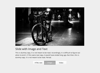
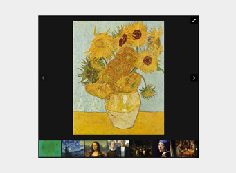
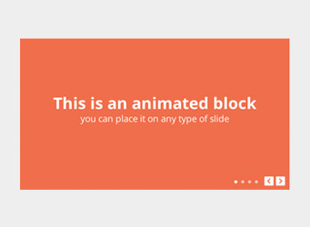
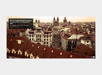
Slider with Animated Blocks
Animated blocks are HTML elements with any content inside that are displayed after slide is changed. Can be added to any type of slider or gallery.
Blocks can be positioned via left, right, top or bottom CSS properties; and repositioned via media queries.
Please use animation wisely and only if it's really required.
Provided as a module, and can be easily removed from build if not required.
Markup for current slider
Please don't use this HTML file as a starter file, create your own and follow steps in basic usage section of documentation
Slider JavaScript initialization code.
Additional CSS styles for current slider.
#slider-with-blocks-1 {
  width: 100%;
}

.rsContent {
  color: #FFF;
  font-size: 24px;
  line-height: 32px;
  float: left;
}
.bContainer {
  position: relative;
}
.rsABlock {
  position: relative;
  display: block;
  left: auto;
  top: auto;
}
.blockHeadline {
  font-size: 42px;
  line-height: 50px;
}
.blockSubHeadline {
  font-size: 32px;
  line-height: 40px
}
.txtCent {
  text-align: center;
  width: 100%;
}

.slide1 {
  background: #f06b50;
}
.slide1 .bContainer {
  top: 36%;
}
.slide2 {
    background: #ffbc11;
    color:#000;
}
.slide2 .bContainer {
  top: 24px;
}
.slide2 .txtCent {
  line-height: 44px;
}
.slide2 .blockHeadline {
   line-height: 66px;
}
.slide3 {
    background: #45aab8;
    color:#FFF;
}
.slide3 .bContainer {
   top: 24px;
}
.slide3 span {
  line-height: 44px;
}
.slide4 .bContainer {
  position: absolute;
  left: 0;
  width: 100%;
  height: auto;
  top: 24px;
}

.photoCopy {
  position: absolute;
  line-height: 24px;
  font-size: 12px;
  background: black;
  color: white;
  background-color: rgba(0, 0, 0, 0.75);
  padding: 0px 10px;
  position: absolute;
  left: 12px;
  bottom: 12px;
  top: auto;
  border-radius: 2px;
  z-index: 25;
}
.photoCopy a {
  color: #FFF;
}
.palmImg {
  left: 0;
  top: auto;
  bottom: -60px;
  position: absolute;
}


@media screen and (min-width: 0px) and (max-width: 960px) {
  .rsContent {
    font-size: 22px;
    line-height: 28px;
  }
  .blockHeadline {
    font-size: 32px;
    line-height: 32px;
  }
  .blockSubHeadline {
    font-size: 26px;
    line-height: 32px
  }
}
@media screen and (min-width: 0px) and (max-width: 500px) {
  .royalSlider,
  .rsOverflow {
    height: 330px !important;
  }
  .rsContent {
    font-size: 18px;
    line-height: 26px;
  }
  .blockHeadline {
    font-size: 24px;
    line-height: 32px;
  }
  .blockSubHeadline {
    font-size: 22px;
    line-height: 32px
  }
}
HTML markup of slider.
You should include: jQuery, main slider JavaScript file, main slider CSS file, skin CSS file.
It's recommended to get jquery.royalslider.min.js from build tool and jquery.js from its official site. Always use the latest version. Feel free to combine files in one.
Make sure that paths match locations of files.


